# import packages
import warnings

import matplotlib.pyplot as plt
import numpy as np
import pandas as pd
import seaborn as sns

# control some deprecation warnings in seaborn
warnings.filterwarnings(
    "ignore",
    category=FutureWarning,
    module="seaborn"
)

# import the dataset
df = pd.read_csv('data/weatherAUS.csv')Visually Exploring Data Using Seaborn
This session will build on the previous session that introduced the Seaborn library, using it to visualise data and do some exploratory analysis.
We are using Australian weather data, taken from Kaggle. This dataset is used to build machine learning models that predict whether it will rain tomorrow, using data about the weather every day from 2007 to 2017. To download the data, click here.
The objective from this session is to:
- Understand how to describe data quantitatively and when different methods are appropriate
- Visualise data as a means of describing it
- Show how to visualising data is a shortcut for describing central tendency, spread, uncertainty etc.
- Introduce ideas around describing and visualising relationships between variables
First, we will take a subset of the data, using Australia’s five biggest cities. This gives us a more manageable dataset to work with.
# subset of observations from five biggest cities
big_cities = (
    df.loc[df['Location'].isin(['Adelaide', 'Brisbane', 'Melbourne', 'Perth', 'Sydney'])]
    .copy()
)
Exploratory Data Analysis
What does exploratory data analysis aim to achieve? What are you looking for when visualising data? Patterns, shapes, signals!
When we describe a variable, or a sample of that variable, we are interested in understanding the characteristics of the observations. The starting point for doing this is describing the value that the data tends to take (central tendency), and how much it tends to deviate from its typical value (spread). Visualising the distribution of a variable can tell us these things (approximately), and can tell us about the shape of the data too.
The “central tendency” is the average or most common value that a variable takes. Mean, median, and mode are all descriptions of the central tendency.
- Mean - Sum of values in a sample divided by the total number of observations.
- Median - The midpoint value if the sample is ordered from highest to lowest.
- Mode - The most common value in the sample1.
The mean is the most common approach, but the mean, median, and mode choice are context-dependent. Other approaches exist, too, such as the geometric mean2.
# mode rainfall by location
big_cities.groupby('Location')['Rainfall'].agg(pd.Series.mode)
Location
Adelaide 0.0
Brisbane 0.0
Melbourne 0.0
Perth 0.0
Sydney 0.0
Name: Rainfall, dtype: float64# mode location
big_cities['Location'].agg(pd.Series.mode)0 Sydney
Name: Location, dtype: object# mode location using value counts
big_cities['Location'].value_counts().iloc[0:1]Location
Sydney 3344
Name: count, dtype: int64# mean rainfall by location
np.round(big_cities.groupby('Location')['Rainfall'].mean(), decimals=2)Location
Adelaide 1.57
Brisbane 3.14
Melbourne 1.87
Perth 1.91
Sydney 3.32
Name: Rainfall, dtype: float64# median rainfall by location
big_cities.groupby('Location')['Rainfall'].median()Location
Adelaide 0.0
Brisbane 0.0
Melbourne 0.0
Perth 0.0
Sydney 0.0
Name: Rainfall, dtype: float64# geometric mean max temperature by location
big_cities.groupby('Location')['MaxTemp'].apply(lambda x: np.exp(np.log(x).mean()))Location
Adelaide 21.888697
Brisbane 26.152034
Melbourne 19.972352
Perth 24.320203
Sydney 22.570993
Name: MaxTemp, dtype: float64The values across the different measures of central tendency are not always the same. In this case, the mean and median differs massively.
Questions:
- Why is that? Why would the median rainfall be zero for all five cities?
- Does this matter? How would it change our understanding of the rainfall variable?
Distributions can tell us more. We have simulated three different distributions that have slightly different shapes, to see how their mean and median values differ.
Plot Code (Click to Expand)
# generate distributions
np.random.seed(123)
normal_dist = np.random.normal(10, 1, 1000)
right_skewed_dist = np.concatenate([np.random.normal(8, 2, 600), np.random.normal(14, 4, 400)])
left_skewed_dist = np.concatenate([np.random.normal(14, 2, 600), np.random.normal(8, 4, 400)])

# set figure size
plt.rcParams['figure.figsize'] = (12, 6)

# function for calculating summary statistics and plotting distributions
def plot_averages(ax, data, title):
    mean = np.mean(data)
    median = np.median(data)

    sns.histplot(data, color="#d9dcd6", bins=30, ax=ax)
    ax.axvline(mean, color="#0081a7", linewidth=3, linestyle="--", label=f"Mean: {mean:.2f}")
    ax.axvline(median, color="#ef233c", linewidth=3, linestyle="--", label=f"Median: {median:.2f}")
    ax.set_title(title)
    ax.set_ylabel('')
    ax.legend()

# plot distributions
fig, axes = plt.subplots(1, 3, sharey=True)

plot_averages(axes[0], normal_dist, "Normal Distribution\n(Mean ≈ Median)")
plot_averages(axes[1], right_skewed_dist, "Right-Skewed Distribution\n(Mean > Median)")
plot_averages(axes[2], left_skewed_dist, "Left-Skewed Distribution\n(Mean < Median)")

plt.suptitle("Comparison of Mean & Median Across Distributions", fontsize=16)
plt.tight_layout()
plt.show()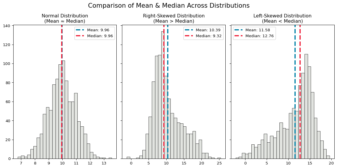
The mean and median of the normal distribution are identical, while the two skewed distributions have slightly different means and medians.
- The mean is larger than the median when the distribution is right-skewed, and the median is larger than the mean when it is left-skewed.
- When the distribution is skewed, the median value will be a better description of the central tendency, because the mean value is more sensitive to extreme values (and skewed distributions have longer tails of extreme values).
These differences point to another important factor to consider when summarising data - the spread or deviation of the sample.
- How do we measure how a sample is spread around the central tendency?
- Standard deviation and variance quantify spread.
- Variance, the average squared difference between observations and the mean value, measures how spread out a sample is.
- Standard deviation is the square root of the variance. It’s easier to interpret because it’s in the same units as the sample.
Plot Code (Click to Expand)
# generate distributions
np.random.seed(123)
mean = 10
std_devs = [1, 2, 3]
distributions = [np.random.normal(mean, std_dev, 1000) for std_dev in std_devs]

# function for calculating summary statistics and plotting distributions
def plot_spread(ax, data, std_dev, title):
    mean = np.mean(data)
    std_dev = np.std(data)

    sns.histplot(data, color="#d9dcd6", bins=30, ax=ax)
    ax.axvline(mean, color="#0081a7", linewidth=3, linestyle="--", label=f"Mean: {mean:.2f}")
    ax.axvline(mean + std_dev, color="#ee9b00", linewidth=3, linestyle="--", label=f"Mean + 1 SD: {mean + std_dev:.2f}")
    ax.axvline(mean - std_dev, color="#ee9b00", linewidth=3, linestyle="--", label=f"Mean - 1 SD: {mean - std_dev:.2f}")
    ax.set_title(f"{title}")
    ax.legend()

# plot distributions
fig, axes = plt.subplots(1, 3, sharey=True, sharex=True)

for i, std_dev in enumerate(std_devs):
    plot_spread(axes[i], distributions[i], std_dev, f"Standard Deviation = {std_dev}")

plt.suptitle("Effect of Standard Deviation on Distribution Shape", fontsize=16)
plt.tight_layout()
plt.show()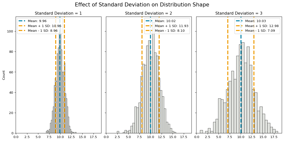
As standard deviation increases, the spread of values around the mean increases.
We can compute various summary statistics that describe a sample (mean, median, standard deviation, kurtosis etc. etc.), or we can just visualise it!
Visualising distributions is a good starting point for understanding a sample. It can quickly and easily tell you a lot about the data.
Exploring Australian Weather
Visualising Single Variables
We can start by visualising the distribution of rainfall and sunshine in Australia’s big cities, including dashed lines to show the mean and median values.
# plot distribution of rainfall
rainfall_mean = np.mean(big_cities['Rainfall'])
rainfall_median = np.median(big_cities['Rainfall'].dropna())

sns.histplot(data=big_cities, x='Rainfall', binwidth=10, color="#d9dcd6")
plt.axvline(rainfall_mean, color="#0081a7", linestyle="--", linewidth=2, label=f"Mean: {rainfall_mean:.2f}")
plt.axvline(rainfall_median, color="#ef233c", linestyle="--", linewidth=2, label=f"Median: {rainfall_median:.2f}")

plt.title("Distribution of Rainfall in Australia's Big Cities")

plt.legend()
plt.tight_layout()
plt.show()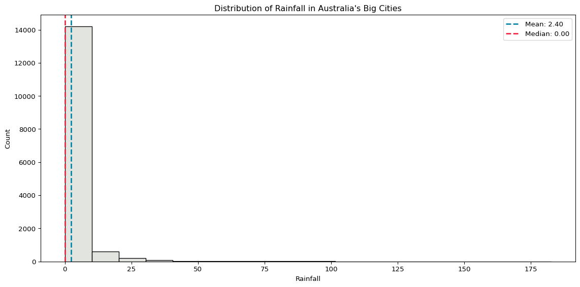
# plot distribution of sunshine
sunshine_mean = np.mean(big_cities['Sunshine'])
sunshine_median = np.median(big_cities['Sunshine'].dropna())

sns.histplot(data=big_cities, x='Sunshine', binwidth=1, color="#d9dcd6")
plt.axvline(sunshine_mean, color="#0081a7", linestyle="--", linewidth=2, label=f"Mean: {sunshine_mean:.2f}")
plt.axvline(sunshine_median, color="#ef233c", linestyle="--", linewidth=2, label=f"Median: {sunshine_median:.2f}")

plt.title("Distribution of Sunshine in Australia's Big Cities")

plt.legend()
plt.tight_layout()
plt.show()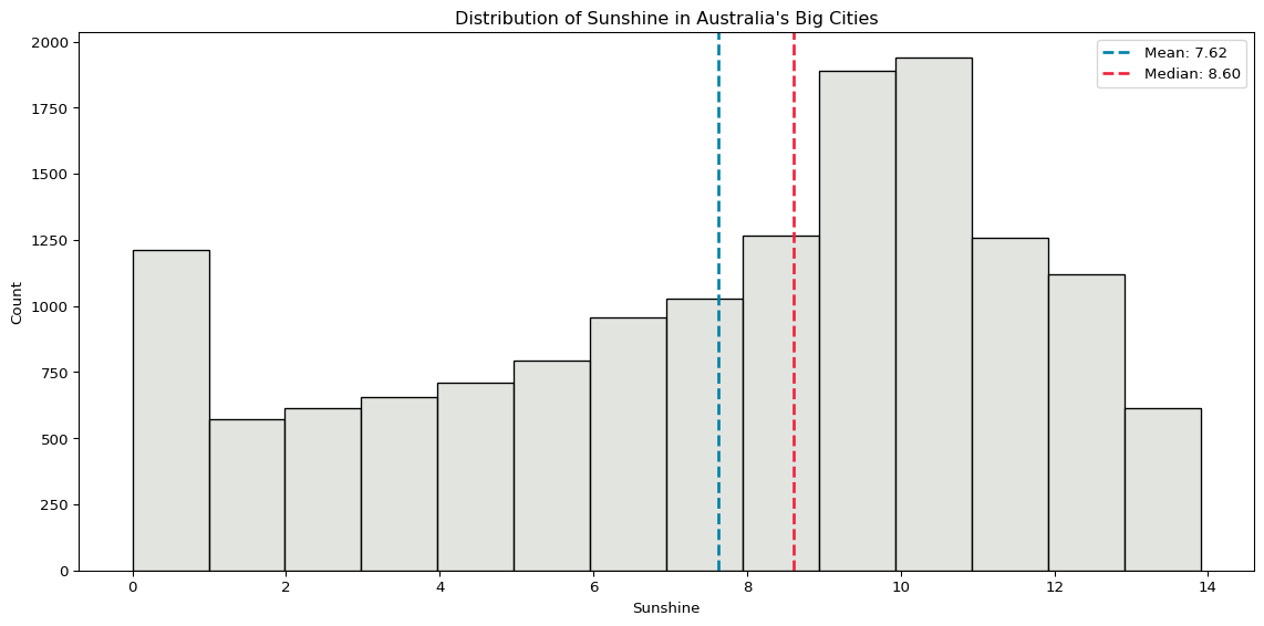
Rainfall is very skewed, because the vast majority of days have zero rainfall. The distribution of sunshine is a little more evenly spread.
While these two plots require a little more code, we can get most of what we want with a lot less just using sns.histplot() on its own. For example, plotting the distribution of maximum temperature, without all the other bells and whistles, already tells us a lot.
sns.histplot(data=big_cities, x='MaxTemp')
plt.tight_layout()
plt.show()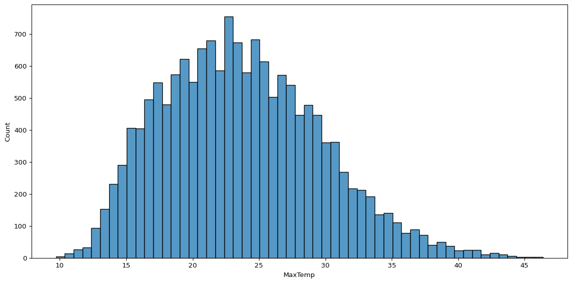
We can also look at the distribution of observations split by group, using sns.countplot(). Below, we see the number of observations per city in our subset.
sns.countplot(big_cities, x='Location', color="#d9dcd6", edgecolor='black')
plt.ylim(3000, 3500)
plt.tight_layout()
plt.show()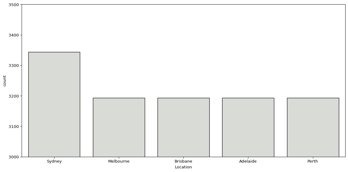
Similarly, we can look at the number of days with or without rain the next day.
sns.countplot(big_cities, x='RainTomorrow', color="#d9dcd6", edgecolor='black')
plt.tight_layout()
plt.show()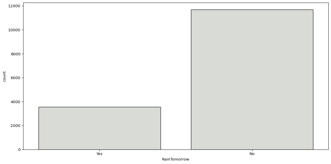
However, it’s worth noting there is a simpler approach to this, just using pd.DataFrame.value_counts().
big_cities['RainTomorrow'].value_counts()RainTomorrow
No 11673
Yes 3543
Name: count, dtype: int64Visualising Multiple Variables
We will often want to know how values of a given variable change based on the values of another. This may not indicate a relationship, but it helps us better understand our data. There are lots of ways we can do this.
We can use sns.barplot() to plot the average hours of sunshine by location.
sns.barplot(big_cities, x='Location', y='Sunshine', color="#d9dcd6", edgecolor='black')
plt.tight_layout()
plt.show()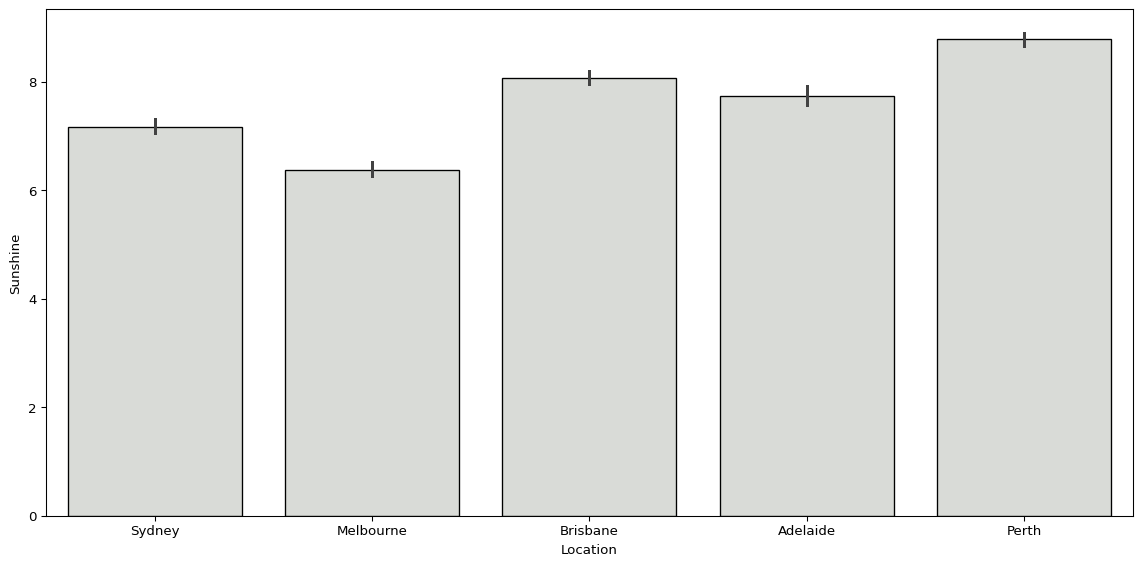
Or we could use sns.boxplot(), visualising the distribution of maximum temperatures and humidity at 3pm by location.
sns.boxplot(big_cities, x='Location', y='MaxTemp', color="#d9dcd6")
plt.tight_layout()
plt.show()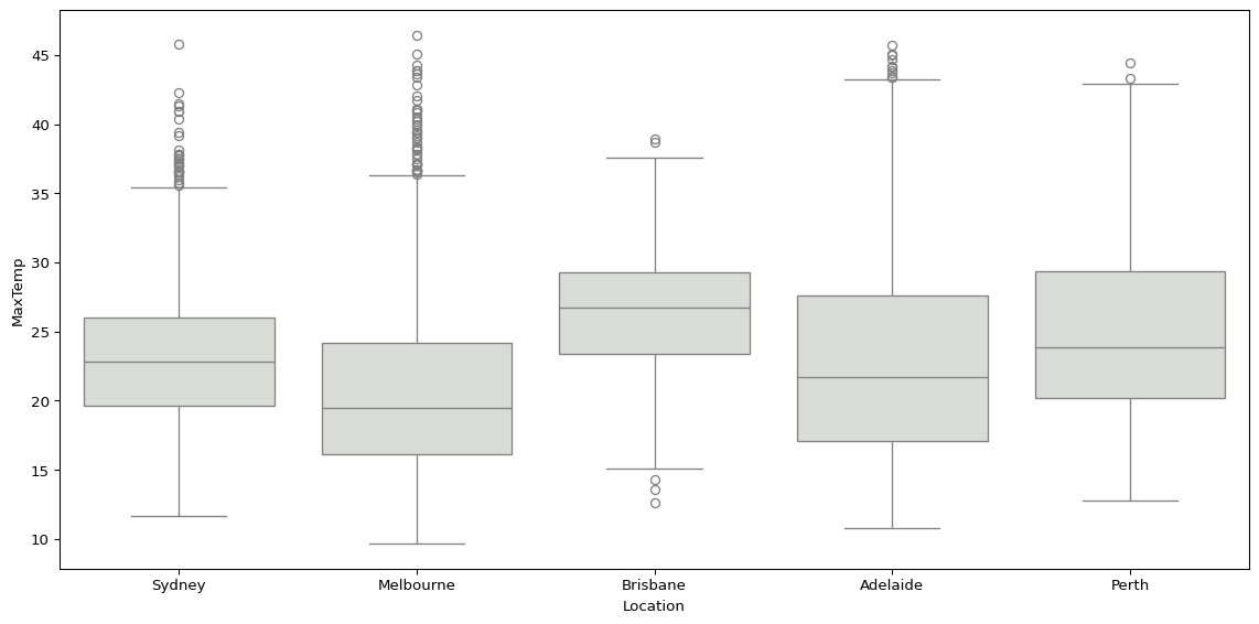
sns.boxplot(data=big_cities, x='RainTomorrow', y='Humidity3pm', color="#d9dcd6")
plt.tight_layout()
plt.show()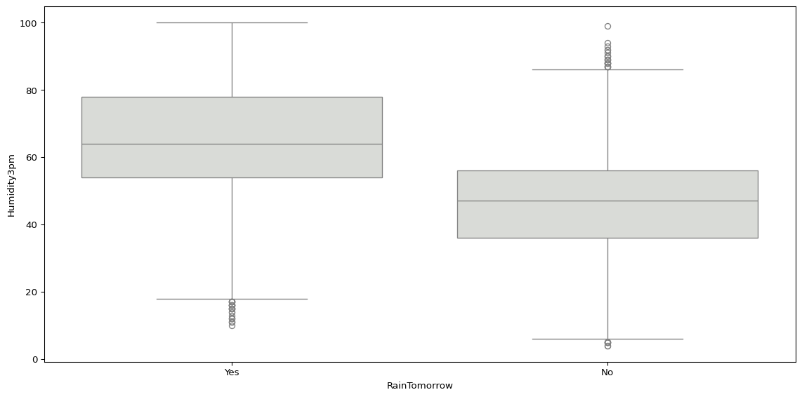
Another way we can compare the distribution of values by groups is using sns.kdeplot(), which visualises a kernel-density estimation.
sns.kdeplot(data=big_cities, x='Humidity3pm', hue='RainTomorrow')
plt.tight_layout()
plt.show()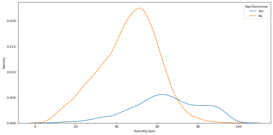
While there are lots of different ways we can quickly and easily compare two variables, or compare the value of a variable by groups, the right approach will always be context-dependent. It will all depend on what questions you have about your data, and which variables you are interested in.
If you have lots of questions about multiple variables, one way of exploring quickly is sns.pairplot().
biggest_cities = big_cities.loc[big_cities["Location"].isin(['Sydney', 'Melbourne'])]
sns.pairplot(
    biggest_cities,
    vars=['MinTemp', 'Sunshine', 'Rainfall'],
    hue='Location'
    )

plt.show()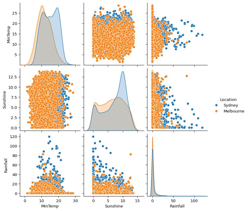
I tend to struggle to infer much from complex plots like this, so I prefer to create separate plots using sns.scatterplot().
sns.scatterplot(big_cities, x='Sunshine', y='MaxTemp', alpha=0.5)

plt.tight_layout()
plt.show()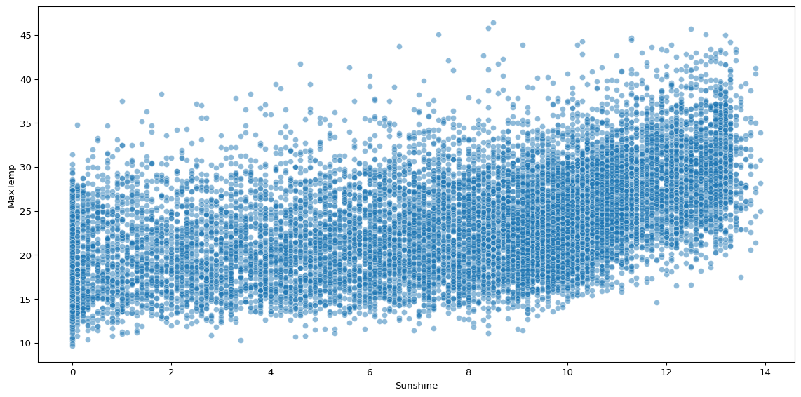
Scatterplots can help you visualise how two continuous variables vary together. The above plot shows that sunshine hours are positively associated with maximum temperature, but there is significant noise.
If we compare this with a scatterplot visualising the association between two variables that should have a strong relationship, such as humidity at 9am and 3pm, we can see the difference.
sns.scatterplot(big_cities, x='Humidity9am', y='Humidity3pm', alpha=0.5)

plt.tight_layout()
plt.show()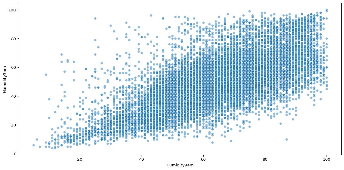
There is still plenty of noise, but as humidity at 9am increases, it is clear that humidity at 3pm is likely to increase.
Another change we might make, to reduce the noise, is adding grouping structures to our scatterplot. Perhaps much of the noise in the sunshine scatterplot is because we are looking at data across many cities.
sns.scatterplot(biggest_cities, x='Sunshine', y='MaxTemp', hue='Location', alpha=0.5)

plt.tight_layout()
plt.show()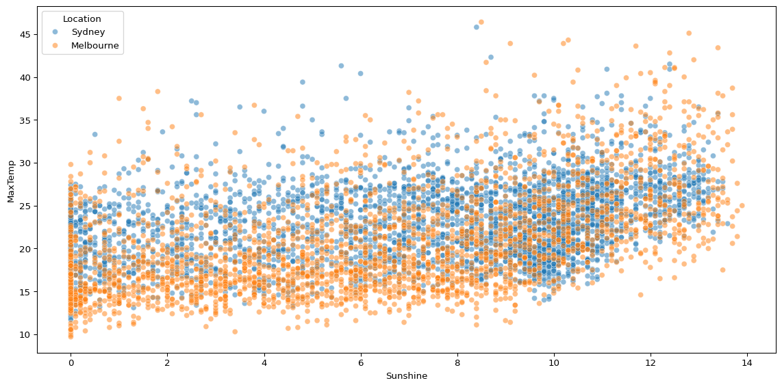
When we compare just two cities, there still appears to be significant noise.
Sometimes you might need to do some more complex operations to transform the data before visualising it, in order to ask more specific questions. For example, you might want to compare how the total rainfall per day has varied over time in the data.
(
    big_cities
    # convert date to datetime
    .assign(Date=pd.to_datetime(big_cities['Date']))
    # create year-month column
    .assign(Year_Month=lambda x: x['Date'].dt.to_period('M'))
    # group by year-month and calculate sum of rainfall
    .groupby('Year_Month')['Rainfall'].sum()
    # convert year-month index back to column in dataframe
    .reset_index()
    # create year-month timestamp for plotting
    .assign(Year_Month=lambda x: x['Year_Month'].dt.to_timestamp())
    # pass df object to seaborn lineplot
    .pipe(lambda df: sns.lineplot(data=df, x='Year_Month', y='Rainfall', linewidth=2))
)

plt.tight_layout()
plt.show()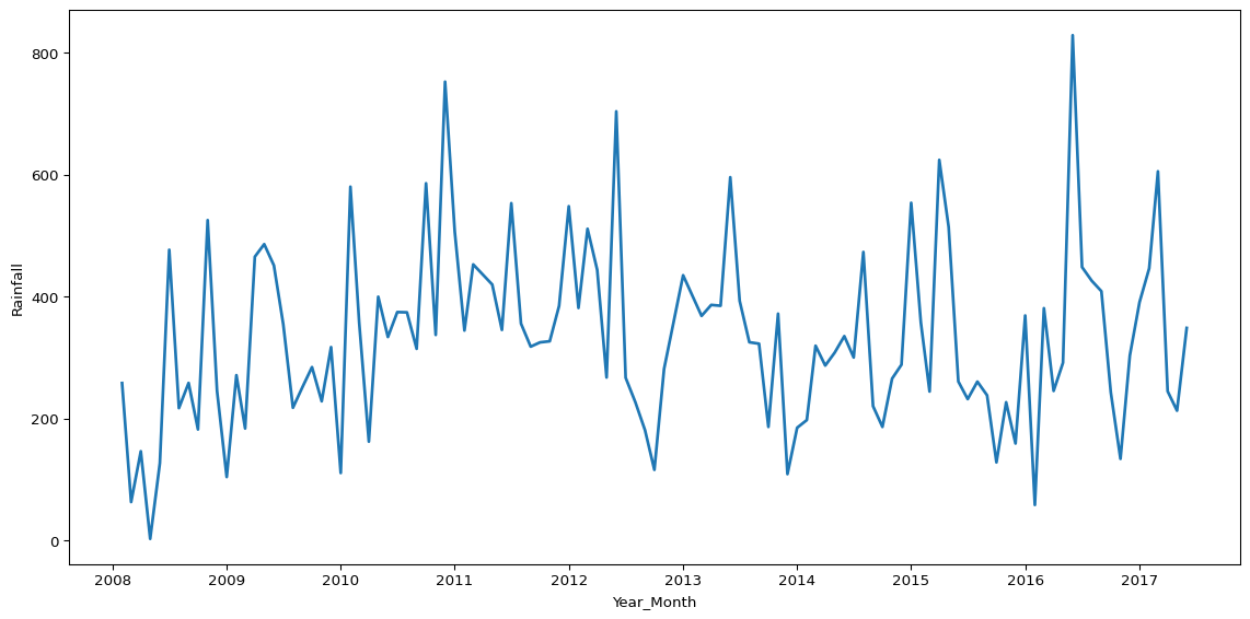
The above plot leverages an approach called method chaining, where we call multiple methods one after the other in the same operation3. Method chaining syntax is sometimes a little easier to follow, and you don’t have to create new objects for every operation, which can be a tidier way to work.
We can do the same to transform the data and visualise the mean average sunshine per month.
(
    big_cities
    # convert date to datetime object
    .assign(Date=pd.to_datetime(big_cities['Date']))
    # set date column as index
    .set_index('Date')
    # resample by month-end for monthly aggregations
    .resample('ME')
    # calculate mean sunshine per month
    .agg({'Sunshine': 'mean'})
    # convert month index back to column in dataframe
    .reset_index()
    # pass df object to seaborn lineplot
    .pipe(lambda df: sns.lineplot(data=df, x='Date', y='Sunshine', color="#1f77b4", linewidth=2))
)

plt.tight_layout()
plt.show()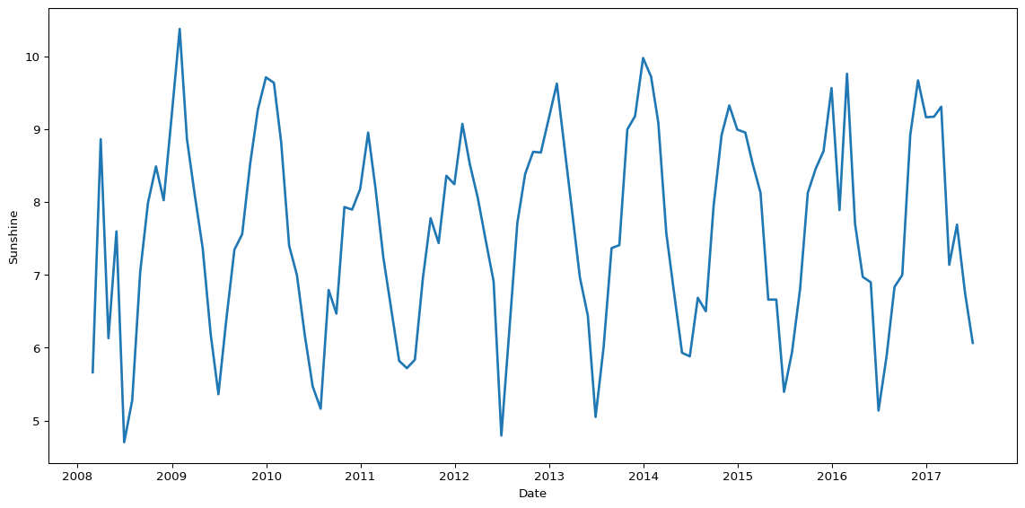
Finally, we could combine two plots to look at how the average rainfall and average sunshine both vary by month.
fig, axes = plt.subplots(1, 2)

(
    big_cities
    .assign(Date=pd.to_datetime(big_cities['Date']))
    .assign(Month=lambda x: x['Date'].dt.month)
    .groupby('Month')['Rainfall'].mean()
    .reset_index()
    .pipe(lambda df: sns.lineplot(data=df, x='Month', y='Rainfall', color="#1f77b4", linewidth=2, ax=axes[0]))
)

(
    big_cities
    .assign(Date=pd.to_datetime(big_cities['Date']))
    .assign(Month=lambda x: x['Date'].dt.month)
    .groupby('Month')['Sunshine'].mean()
    .reset_index()
    .pipe(lambda df: sns.lineplot(data=df, x='Month', y='Sunshine', color="#ff7f0e", linewidth=2, ax=axes[1]))
)

xticks = range(1, 13)
xticklabels = ['Jan', 'Feb', 'Mar', 'Apr', 'May', 'Jun', 'Jul', 'Aug', 'Sep', 'Oct', 'Nov', 'Dec']
for ax in axes:
    ax.set_xticks(xticks)  # Set ticks
    ax.set_xticklabels(xticklabels, rotation=45)
    ax.set_xlabel('')
    ax.set_ylabel('')
axes[0].set_title('Average Rainfall by Month', fontsize=16)
axes[1].set_title('Average Sunshine by Month', fontsize=16)

plt.tight_layout()
plt.show()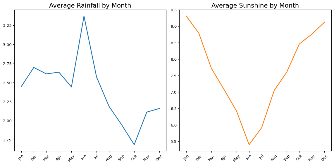
Exercises
Some of these questions are easily answered by scrolling up and finding the answer in the output of the above code, however, the goal is to find the answer using code. No one actually cares what the answer to any of these questions is, it’s the process that matters!
Remember, if you don’t know the answer, it’s okay to Google it (or speak to others, including me, for help)!
Import Data (to Reset)
# import the dataset
df = pd.read_csv('data/weatherAUS.csv')- What does the distribution of minimum daily temperatures look like in these cities? Are there any unusual patterns?
NoteSolution
sns.histplot(big_cities["MinTemp"].dropna(), kde=True)
plt.title("Distribution of MinTemp")
plt.show()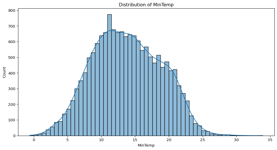
- Does the amount of sunshine vary depending on whether it rains the next day? Visualise this.
NoteSolution
sns.boxplot(data=big_cities, x="RainTomorrow", y="Sunshine")
plt.title("Sunshine by Rain Tomorrow")
plt.show()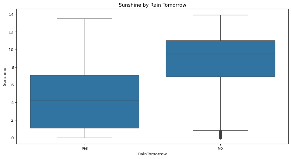
- How closely related are atmospheric pressure readings in the morning compared to the afternoon?
NoteSolution
sns.scatterplot(data=big_cities, x="Pressure9am", y="Pressure3pm")
plt.title("Pressure at 9am vs 3pm")
plt.show()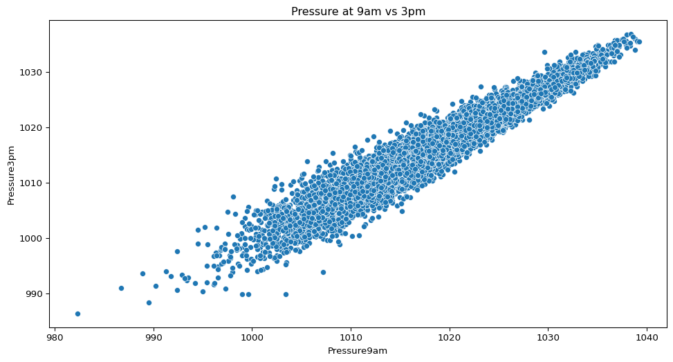
- How does humidity in the afternoon vary across the five cities? What can you infer from this?
NoteSolution
sns.violinplot(data=big_cities, x="Location", y="Humidity3pm")
plt.title("Humidity at 3pm by City")
plt.show()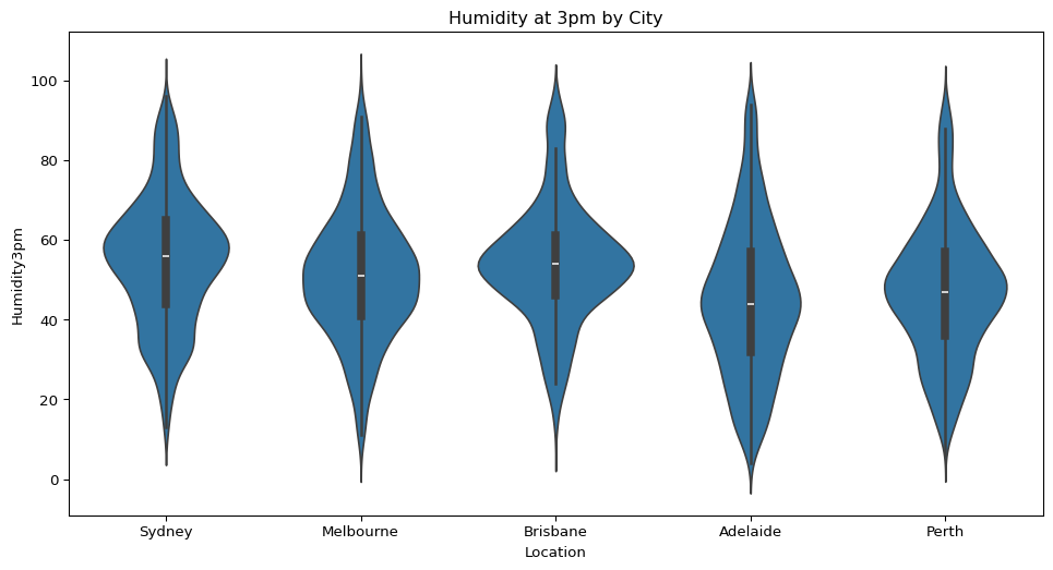
- Are days when rain is expected tomorrow more or less common in this dataset? Show the distribution.
NoteSolution
sns.countplot(data=big_cities, x="RainTomorrow")
plt.title("Rain Tomorrow Counts")
plt.show()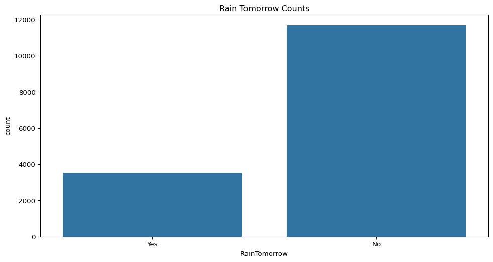
- Is there any relationship between afternoon temperature and humidity? Does this relationship change depending on whether it rains the next day?
NoteSolution
sns.scatterplot(data=big_cities, x="Temp3pm", y="Humidity3pm", hue="RainTomorrow")
plt.title("Temp vs Humidity at 3pm by Rain Tomorrow")
plt.show()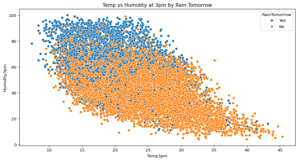
- How strongly are the different continuous variables in this dataset correlated with each other? Create a correlation matrix.
NoteSolution
corr = big_cities.select_dtypes(include="number").corr().round(2)
plt.figure(figsize=(10, 8))
sns.heatmap(corr, annot=True, cmap="coolwarm", center=0)
plt.title("Correlation Matrix")
plt.show()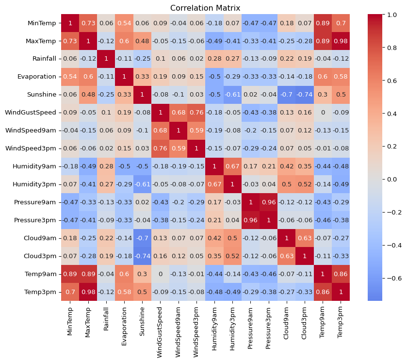
- Explore the relationships between rainfall, sunshine, and afternoon humidity across the cities. What patterns stand out?
NoteSolution
sns.pairplot(big_cities, vars=["Rainfall", "Sunshine", "Humidity3pm"], hue="Location")
plt.show()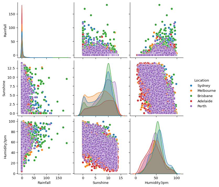
- How has the maximum temperature in Brisbane changed over time? Create a time series visualisation.
NoteSolution
brisbane = big_cities.loc[big_cities["Location"] == "Brisbane"]
brisbane['Date'] = pd.to_datetime(brisbane['Date'])
brisbane_daily = brisbane.groupby("Date")["MaxTemp"].mean().reset_index()

plt.figure(figsize=(12, 4))
sns.lineplot(data=brisbane_daily, x="Date", y="MaxTemp")
plt.title("Daily Max Temp in Brisbane")

plt.show()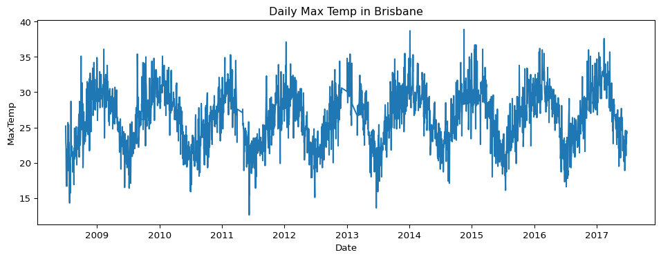
- What does the distribution of daily rainfall amounts look like? Is it skewed or symmetric?
NoteSolution
sns.kdeplot(data=big_cities, x="Rainfall", fill=True)
plt.title("Rainfall Distribution")
plt.show()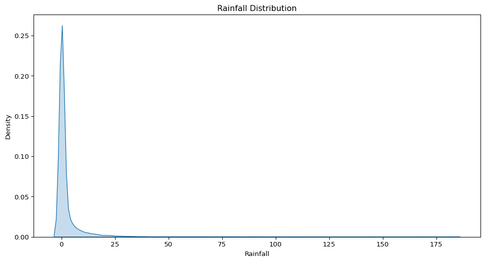
- How does the average morning wind speed compare across the five cities?
NoteSolution
sns.barplot(data=big_cities, x="Location", y="WindSpeed9am", ci=None)
plt.title("Average Morning Wind Speed by City")
plt.show()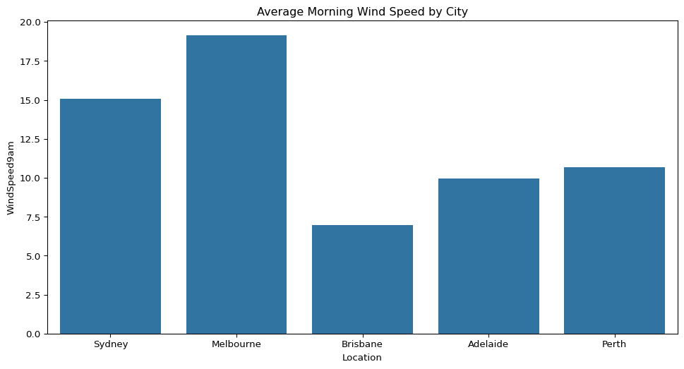
- In Perth, is there any visible relationship between the amount of sunshine and rainfall?
NoteSolution
perth = big_cities.loc[big_cities["Location"] == "Perth"]
sns.scatterplot(data=perth, x="Sunshine", y="Rainfall")
plt.title("Sunshine vs Rainfall in Perth")
plt.show()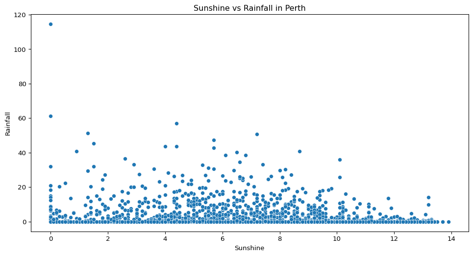
Footnotes
The mode value is generally most useful when dealing with categorical variables.↩︎
The geometric mean multiplies all values in the sample and takes the \(n\)th root of that multiplied value. It can be useful when dealing with skewed data or data with very large ranges, and when dealing with rates, proportions etc. However it can’t handle zeros or negative values.↩︎
This may not be something you feel comfortable with yet, but it is something you may come across, and could explore in the future.↩︎