In previous sessions, we learned how linear regression works: fit a straight line to data, minimise prediction error, and use that line for prediction and inference. Linear regression is powerful, but it assumes relationships are linear. In reality, data often follows curves, has constraints, or exhibits patterns that straight lines can’t capture.
This session explores how the linear regression framework is adapted to non-linear patterns, using generalised linear models (GLMs), through link functions. We’ll see that the same core idea, fitting a line through data to describe the relationship between variables, works for binary outcomes, counts, and other constrained data types. The key is transforming the scale so linear models can work.
We’ll focus on logistic regression for binary outcomes, implement it with real data, and briefly introduce other extensions like multilevel models and GAMs.
Slides
Use the left ⬅️ and right ➡️ arrow keys to navigate through the slides below. To view in a separate tab/window, follow this link.
When Linear Regression Fails
Linear regression assumes the relationship between predictors and outcome is linear. This works when each unit increase in \(X\) produces a constant change in \(Y\). But many real-world relationships don’t follow this pattern.
Examples of Non-Linear Data
Binary outcomes - Survived/died, yes/no, pass/fail. Outcomes are 0 or 1, not continuous.
Count data - Number of hospital visits, customer complaints. Must be non-negative integers.
Proportions - Percentage passing an exam, recovery rates. Bounded between 0 and 1.
Growth curves - Disease spread, population growth. Exponential or S-shaped patterns.
Forcing linear regression onto these data types produces nonsensical predictions (probabilities above 1, negative counts) and violates model assumptions.
The Problem Illustrated
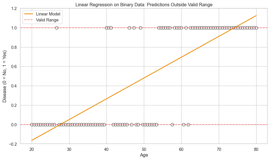
import pandas as pdimport numpy as npimport matplotlib.pyplot as pltimport seaborn as snsfrom sklearn.linear_model import LinearRegression, LogisticRegression# set visualisation stylesns.set_theme(style="whitegrid")plt.rcParams['figure.figsize'] = (10, 6)# simulate binary outcome datanp.random.seed(42)age = np.linspace(20, 80, 100)prob_true =1/ (1+ np.exp(-(age -50) /8))disease = np.random.binomial(1, prob_true)# fit linear regressionmodel_linear = LinearRegression()model_linear.fit(age.reshape(-1, 1), disease)pred_linear = model_linear.predict(age.reshape(-1, 1))# plotfig, ax = plt.subplots(figsize=(10, 6))sns.scatterplot(x=age, y=disease, facecolors='white', edgecolors='black', s=60, linewidths=1, alpha=0.7, ax=ax)sns.lineplot(x=age, y=pred_linear, color='#ED8B00', linewidth=2, ax=ax, label='Linear Model')ax.axhline(y=0, color='red', linestyle='--', alpha=0.5, label='Valid Range')ax.axhline(y=1, color='red', linestyle='--', alpha=0.5)ax.set_xlabel('Age')ax.set_ylabel('Disease (0 = No, 1 = Yes)')ax.set_title('Linear Regression on Binary Data: Predictions Outside Valid Range')ax.set_ylim(-0.2, 1.2)ax.legend()plt.tight_layout()plt.show()
Linear regression predicts values below 0 and above 1, which make no sense for binary outcomes.
The Solution - Link Functions
Generalised linear models adapt the linear model framework to work with non-linear data. Link functions transform the scale so that a linear model fits the data. Instead of fitting a line directly to constrained data, we:
Transform the outcome to an unbounded scale
Fit a linear model on the transformed scale
Transform predictions back to the original scale
This preserves the linearity of the model while respecting data constraints.
How Logistic Regression Works (Click to Expand)
The Logit Link
For binary outcomes, we use the logit link, which models the log-odds.
The left side of this equation is the log-odds for an outcome of probability \(p\). This can be any value from \(-\infty\) to \(+\infty\). This is equivalent to the right side of the equation, which is the linear predictor we have encountered in previous sessions.
To get probabilities, we transform back using the inverse logit.
\[
p = \frac{1}{1 + e^{-(\beta_0 + \beta_1X)}}
\]
This produces an S-shaped curve that stays between 0 and 1.
Why Log-Odds?
Odds represent the ratio of success to failure: \(\frac{p}{1-p}\). If \(p = 0.8\), odds are \(\frac{0.8}{0.2} = 4\) (4 to 1 in favour). Taking the log makes this unbounded:
\(p = 0.5\) → odds = 1 → log-odds = 0
\(p\) close to 0 → odds close to 0 → log-odds \(\to -\infty\)
\(p\) close to 1 → odds \(\to \infty\) → log-odds \(\to +\infty\)
Now we can fit a linear model on the log-odds scale.
Logistic Regression in Practice
Let’s implement logistic regression using the Titanic dataset. Our goal is to predict passenger survival based on characteristics like age, sex, and passenger class.
Load and Prepare Data
# load titanic dataurl ='https://raw.githubusercontent.com/datasciencedojo/datasets/master/titanic.csv'titanic = pd.read_csv(url)# select relevant columns and drop missing valuesdf = titanic[['Survived', 'Pclass', 'Sex', 'Age', 'Fare']].dropna()# convert sex to binarydf['Sex'] = (df['Sex'] =='female').astype(int)print(f"Dataset shape: {df.shape}")print("\nFirst few rows:")print(df.head(10))
Before modelling, examine the relationships between predictors and survival.
# overall survival ratesurvival_rate = df['Survived'].mean()print(f"Overall survival rate: {survival_rate:.1%}")# survival by sexsurvival_sex = df.groupby('Sex')['Survived'].mean()print("\nSurvival rate by sex:")print(survival_sex.to_frame().rename(columns={'Survived': 'Survival Rate'}))
Overall survival rate: 40.6%

Survival rate by sex:
     Survival Rate
Sex
0         0.205298
1         0.754789
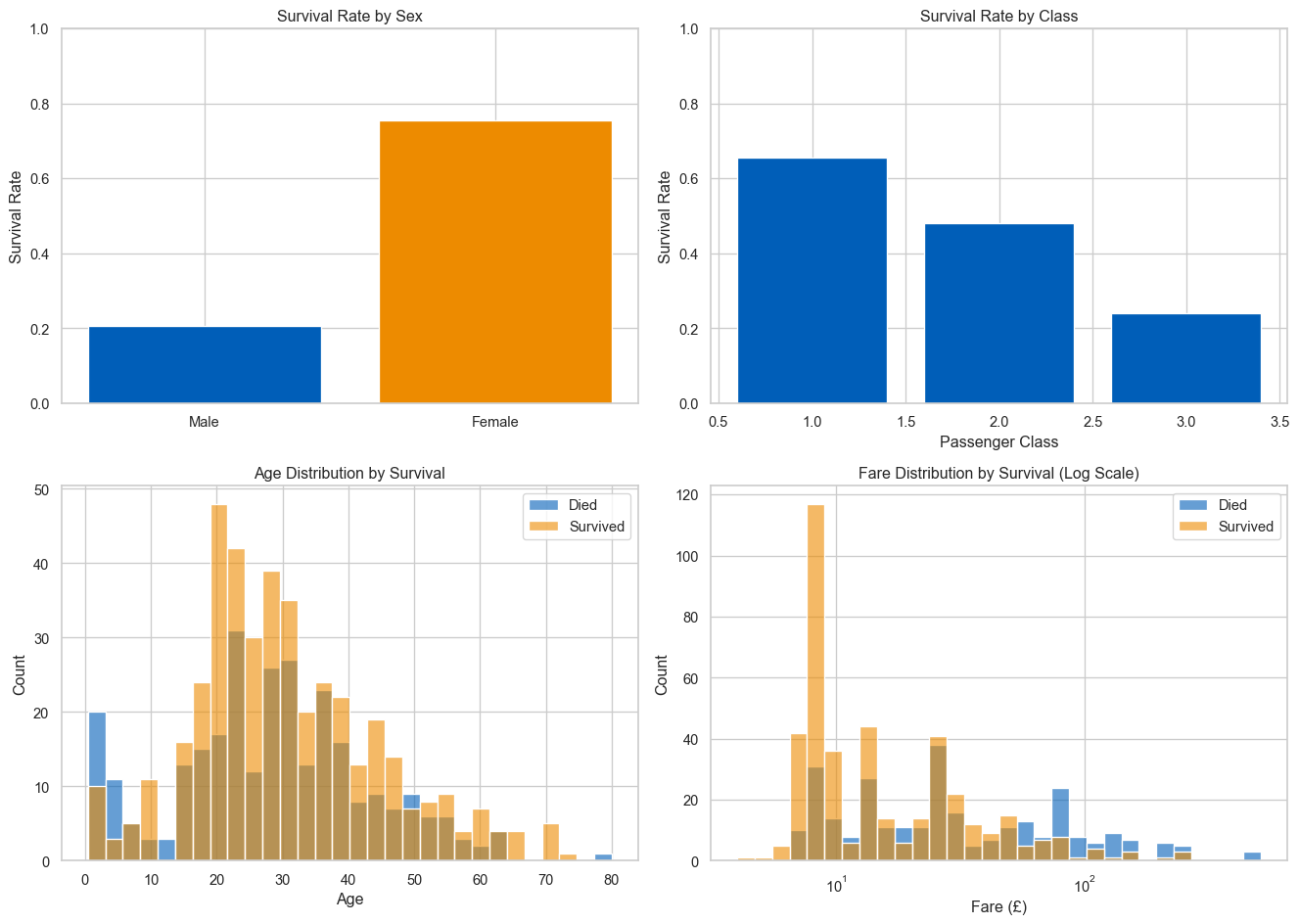
fig, axes = plt.subplots(2, 2, figsize=(14, 10))# survival by sexsurvival_sex = df.groupby('Sex')['Survived'].mean()axes[0, 0].bar(['Male', 'Female'], survival_sex.values, color=['#005EB8', '#ED8B00'])axes[0, 0].set_ylabel('Survival Rate')axes[0, 0].set_title('Survival Rate by Sex')axes[0, 0].set_ylim(0, 1)# survival by classsurvival_class = df.groupby('Pclass')['Survived'].mean()axes[0, 1].bar(survival_class.index, survival_class.values, color='#005EB8')axes[0, 1].set_xlabel('Passenger Class')axes[0, 1].set_ylabel('Survival Rate')axes[0, 1].set_title('Survival Rate by Class')axes[0, 1].set_ylim(0, 1)# age distribution by survivalsns.histplot(data=df, x='Age', hue='Survived', bins=30, ax=axes[1, 0], palette={0: '#ED8B00', 1: '#005EB8'}, alpha=0.6)axes[1, 0].set_title('Age Distribution by Survival')axes[1, 0].set_xlabel('Age')axes[1, 0].legend(['Died', 'Survived'])# fare distribution by survivalsns.histplot(data=df, x='Fare', hue='Survived', bins=30, ax=axes[1, 1], palette={0: '#ED8B00', 1: '#005EB8'}, alpha=0.6, log_scale=True)axes[1, 1].set_title('Fare Distribution by Survival (Log Scale)')axes[1, 1].set_xlabel('Fare (£)')axes[1, 1].legend(['Died', 'Survived'])plt.tight_layout()plt.show()
Women, first-class passengers, and children had higher survival rates. Fare correlates with class.
Fitting a Logistic Regression Model
We’ll fit two models: a simple model with only sex as a predictor, and a multiple model with all predictors.
from sklearn.model_selection import train_test_splitfrom sklearn.metrics import accuracy_score, confusion_matrix, classification_report# prepare dataX = df[['Sex', 'Age', 'Pclass', 'Fare']]y = df['Survived']# split into train and test setsX_train, X_test, y_train, y_test = train_test_split( X, y, test_size=0.2, random_state=42)# fit logistic regressionclf = LogisticRegression(max_iter=1000)clf.fit(X_train, y_train)
LogisticRegression(max_iter=1000)
In a Jupyter environment, please rerun this cell to show the HTML representation or trust the notebook. On GitHub, the HTML representation is unable to render, please try loading this page with nbviewer.org.
Parameters
penalty
'l2'
dual
False
tol
0.0001
C
1.0
fit_intercept
True
intercept_scaling
1
class_weight
None
random_state
None
solver
'lbfgs'
max_iter
1000
multi_class
'deprecated'
verbose
0
warm_start
False
n_jobs
None
l1_ratio
None
Interpreting Coefficients
import statsmodels.api as sm# use statsmodels for detailed outputX = sm.add_constant(X)glm = sm.Logit(y, X).fit()print(glm.summary().tables[1])
Optimization terminated successfully.
         Current function value: 0.453242
         Iterations 6
==============================================================================
                 coef    std err          z      P>|z|      [0.025      0.975]
------------------------------------------------------------------------------
const          2.4698      0.525      4.707      0.000       1.442       3.498
Sex            2.5182      0.208     12.115      0.000       2.111       2.926
Age           -0.0367      0.008     -4.780      0.000      -0.052      -0.022
Pclass        -1.2697      0.159     -8.005      0.000      -1.581      -0.959
Fare           0.0005      0.002      0.246      0.805      -0.004       0.005
==============================================================================
Coefficients are on the log-odds scale. Positive coefficients increase the probability of survival, negative coefficients decrease it.
Sex (Female) - Coefficient = 2.52. Being female increases log-odds of survival. On the probability scale, women had much higher survival rates.
Age - Coefficient = -0.037. Younger passengers had slightly higher survival rates.
Fare - Coefficient = 0.001. Higher fares (correlated with class) increase survival.
Converting Coefficients to Odds Ratios
Exponentiate coefficients to get odds ratios.
odds_ratios = np.exp(glm.params)conf_int = np.exp(glm.conf_int())results_df = pd.DataFrame({'Odds Ratio': odds_ratios,'95% CI Lower': conf_int[0],'95% CI Upper': conf_int[1]}).round(2)print("\nOdds Ratios:")print(results_df)
Odds Ratios:
        Odds Ratio  95% CI Lower  95% CI Upper
const        11.82          4.23         33.05
Sex          12.41          8.25         18.65
Age           0.96          0.95          0.98
Pclass        0.28          0.21          0.38
Fare          1.00          1.00          1.00
Sex - Being female multiplies the odds of survival by ~11. Women were much more likely to survive.
Age - Each year of age multiplies odds by ~0.97 (slight decrease).
Pclass - Each class decrease (e.g., 2nd to 3rd) multiplies odds by ~0.33.
Making Predictions
# predict probabilities on test sety_pred_prob = clf.predict_proba(X_test)[:, 1]y_pred = clf.predict(X_test)# model performanceaccuracy = accuracy_score(y_test, y_pred)print(f"Test set accuracy: {accuracy:.1%}")# confusion matrixcm = confusion_matrix(y_test, y_pred)print("\nConfusion Matrix:")print(pd.DataFrame(cm, columns=['Predicted: Died', 'Predicted: Survived'], index=['Actual: Died', 'Actual: Survived']))# classification reportprint("\nClassification Report:")print(classification_report(y_test, y_pred, target_names=['Died', 'Survived']))
Test set accuracy: 75.5%

Confusion Matrix:
                  Predicted: Died  Predicted: Survived
Actual: Died                   68                   19
Actual: Survived               16                   40

Classification Report:
              precision    recall  f1-score   support

        Died       0.81      0.78      0.80        87
    Survived       0.68      0.71      0.70        56

    accuracy                           0.76       143
   macro avg       0.74      0.75      0.75       143
weighted avg       0.76      0.76      0.76       143
The model correctly classifies ~76% of passengers. It performs better at predicting deaths than survivals, likely because more passengers died overall.
Visualising Predictions
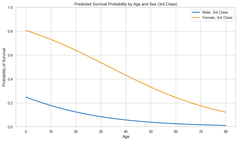
# create a grid of ages and predict survival probability for male/female passengersage_range = np.linspace(0, 80, 100)# predictions for male, 3rd class passengersX_male = pd.DataFrame({'Sex': 0,'Age': age_range,'Pclass': 3,'Fare': df['Fare'].median()})# predictions for female, 3rd class passengersX_female = pd.DataFrame({'Sex': 1,'Age': age_range,'Pclass': 3,'Fare': df['Fare'].median()})prob_male = clf.predict_proba(X_male)[:, 1]prob_female = clf.predict_proba(X_female)[:, 1]fig, ax = plt.subplots(figsize=(10, 6))sns.lineplot(x=age_range, y=prob_male, color='#005EB8', linewidth=2, label='Male, 3rd Class', ax=ax)sns.lineplot(x=age_range, y=prob_female, color='#ED8B00', linewidth=2, label='Female, 3rd Class', ax=ax)ax.set_xlabel('Age')ax.set_ylabel('Probability of Survival')ax.set_title('Predicted Survival Probability by Age and Sex (3rd Class)')ax.set_ylim(0, 1)ax.legend()plt.tight_layout()plt.show()
Female passengers had much higher predicted survival probabilities across all ages. Younger passengers (especially children) had higher survival rates, consistent with “women and children first”.
Other Extensions of Linear Regression
Logistic regression is just one example of adapting the linear framework to non-linear data, but there are many ways this framework can be extended.
Poisson Regression for Count Data
When outcomes are counts (number of events, visits, occurrences), Poisson regression uses a log link.
Model Formula (Click to Expand)
\[
\log(\text{E}[Y]) = \beta_0 + \beta_1X
\]
Transform back to get expected count: \(\text{E}[Y] = e^{\beta_0 + \beta_1X}\). Predictions are always positive, matching count data.
Example use cases - Number of hospital admissions, customer complaints, goals scored.
Generalised Additive Models (GAMs)
GAMs fit smooth, flexible curves instead of straight lines.
Each \(f_i(X_i)\) is a smooth function that adapts to the data. GAMs capture complex non-linear patterns (U-shapes, wiggles) while remaining interpretable.
Example use cases - Temperature effects on sales, age-related health trends, non-linear dose-response relationships.
Python implementation uses pygam:
from pygam import GAM, s# fit a GAM with smooth functionsgam = GAM(s(0) + s(1))gam.fit(X, y)
Multilevel Models
When data has hierarchical structure (students in schools, patients in hospitals, repeated measures on individuals), multilevel models account for grouping.
\(u_j\) is a group-specific effect (random intercept).
Groups can have different baselines but share information.
Example use cases - Educational data (students in schools), clinical trials (patients in sites), longitudinal data (repeated measures on individuals).
Python implementation uses statsmodels or pymer4:
import statsmodels.formula.api as smf# fit a multilevel modelmlm = smf.mixedlm("y ~ x", data=df, groups=df["group_id"])result = mlm.fit()
Survival Analysis
When modelling time until an event (death, failure, recovery), use survival models like Cox proportional hazards regression. These account for censoring (observations where the event hasn’t occurred yet).
Example use cases - Patient survival times, equipment failure, customer churn.
Why This Matters
All these models share the same foundation: linear regression. Once you understand fitting a line to data, you can:
Use link functions for constrained outcomes (binary, counts, proportions)
Fit flexible curves with GAMs
Account for hierarchy with multilevel models
Model time-to-event data with survival analysis
The linear framework is incredibly versatile. It’s not just for linear relationships.
Summary
Real data often violates linear regression assumptions
Link functions transform data so linear models work